Colors of April: #Beotkkotbomsaek and #Sarangeppajinttalgisaek
As part of the celebrations for its 75th anniversary, Samhwa Paints has given a native Korean name to each month of the year and also selected the colors representing each month. Samhwa is happy to unveil its name and colors for the month of April.
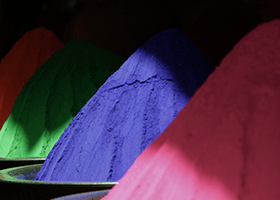
Samhwa renamed April Ipsaedal, which means “the month when new buds begin to rise from plump branches.” April is the month when trees begin to turn green and spring flowers begin to bloom. The colors chosen by the company for this month are Beotkkotbomsaek (“Spring Cherry Blossom”) and Sarangeppajinttalgisaek (“Strawberry Falling in Love”), two warm and lovely colors that stoke excitement and hope for good things to come.
April marks the undeniable arrival of spring in Korea as that is when the cherry trees that line every major street in the nation’s cities and towns begin to blossom. Cherry blossoms create romantic scenery against which couples, friends, and families enjoy outdoor activities now that the weather is warming. Beotkkotbomsaek brings the warm spring energy people feel as they step outside and take in the scented air. The infinite number of cherry blossom petals flying in the spring breeze adds even more to the loveliness of the season.
Pink has long been derided as a “girly” and immature color. It is still avoided as a color of choice for interior design in many cases. Depending on what other colors it is matched with, however, pink is capable of creating a stylish and sophisticated-looking space. It is especially recommended if you are looking to freshen up your indoor environment as a welcome for spring. Pink colors like Beotkkotbomsaek, when used with monochrome and neutral colors, can convey a calm, soothing energy. Use it with cold hues and you can achieve an effect that is simultaneously chic and bright. Warm-colored lights, instead of cool, will add class and luxury to the atmosphere as well.
Sarangeppajinttalgisaek is the color of first love. Fresh and succulent like strawberries, the color has the power to warm your senses and increase your anticipation of a new relationship in spring. Sarangeppajinttalgisaek is designed to mimic the energy of laughter shared by families, friends, and couples in joyful unions.
Warm reds like Sarangeppajinttalgisaek have the power to lift us up out of our depressed, nervous state with a boost of energy. We recommend this energetic hue to anyone who wishes to redo an interior to break the monotony of everyday life. Since the color is quite vivid, we suggest using it on a limited surface or smaller objects only rather than painting it all across a large surface. Sarangeppajinttalgisaek would be a colorful accent in an open space, such as the living room or kitchen. Adding this color to a neutral, monotone palette will bring depth to the space. If you aren’t keen on painting it on a wall, you might enjoy repainting your children’s toys or your favorite interior objects with it.
What do you think of Samhwa’s choice of the name and colors for April? Stay tuned next month for more new names and colors in native Korean!
Find inspiration on how to make your everyday surroundings exceptional
Colors of April: #Beotkkotbomsaek and #Sarangeppajinttalgisaek
2024.01.17
As part of the celebrations for its 75th anniversary, Samhwa Paints has given a native Korean name to each month of the year and also selected the colors representing each month. Samhwa is happy to unveil its name and colors for the month of April.
Samhwa renamed April Ipsaedal, which means “the month when new buds begin to rise from plump branches.” April is the month when trees begin to turn green and spring flowers begin to bloom. The colors chosen by the company for this month are Beotkkotbomsaek (“Spring Cherry Blossom”) and Sarangeppajinttalgisaek (“Strawberry Falling in Love”), two warm and lovely colors that stoke excitement and hope for good things to come.
April marks the undeniable arrival of spring in Korea as that is when the cherry trees that line every major street in the nation’s cities and towns begin to blossom. Cherry blossoms create romantic scenery against which couples, friends, and families enjoy outdoor activities now that the weather is warming. Beotkkotbomsaek brings the warm spring energy people feel as they step outside and take in the scented air. The infinite number of cherry blossom petals flying in the spring breeze adds even more to the loveliness of the season.
Pink has long been derided as a “girly” and immature color. It is still avoided as a color of choice for interior design in many cases. Depending on what other colors it is matched with, however, pink is capable of creating a stylish and sophisticated-looking space. It is especially recommended if you are looking to freshen up your indoor environment as a welcome for spring. Pink colors like Beotkkotbomsaek, when used with monochrome and neutral colors, can convey a calm, soothing energy. Use it with cold hues and you can achieve an effect that is simultaneously chic and bright. Warm-colored lights, instead of cool, will add class and luxury to the atmosphere as well.
Sarangeppajinttalgisaek is the color of first love. Fresh and succulent like strawberries, the color has the power to warm your senses and increase your anticipation of a new relationship in spring. Sarangeppajinttalgisaek is designed to mimic the energy of laughter shared by families, friends, and couples in joyful unions.
Warm reds like Sarangeppajinttalgisaek have the power to lift us up out of our depressed, nervous state with a boost of energy. We recommend this energetic hue to anyone who wishes to redo an interior to break the monotony of everyday life. Since the color is quite vivid, we suggest using it on a limited surface or smaller objects only rather than painting it all across a large surface. Sarangeppajinttalgisaek would be a colorful accent in an open space, such as the living room or kitchen. Adding this color to a neutral, monotone palette will bring depth to the space. If you aren’t keen on painting it on a wall, you might enjoy repainting your children’s toys or your favorite interior objects with it.
What do you think of Samhwa’s choice of the name and colors for April? Stay tuned next month for more new names and colors in native Korean!
This website uses cookies so that we can provide you with the best user experience possible. Cookie information is stored in your browser and performs functions such as recognising you when you return to our website and helping our team to understand which sections of the website you find most interesting and useful.
Strictly Necessary Cookies
Strictly Necessary Cookie should be enabled at all times so that we can save your preferences for cookie settings.
If you disable this cookie, we will not be able to save your preferences. This means that every time you visit this website you will need to enable or disable cookies again.
 Wall paint
친환경 벽지 페인트
Wall paint
친환경 벽지 페인트